The following is a hypothetical study done to complete the IBM Data Science course which I completed on the Coursera platform. The assignment was to define a business problem and then offer a solution. An additional caveat was that the solution needed to link Foursquare’s data to the data set under initial consideration. What follows here is the summary of the problem and the solution. I believe the conclusions are sound, given the initial problem, and the analysis is accurate.
The value is driven by content of the underlying data set collated by the New York City Department of Planning. The data set is titled New York City Neighborhood Name Centroids. It was perfect for solving the problem at hand because it used centroids to locate the center of a set of neighborhoods in New York. If one is looking to place a specific retail location in a city, the population center of gravity is relevant. A centroid is defined as “the center of mass of a geometric object of uniform density.”
So, if the assumption of the endeavor is that New York City in general and Manhattan specifically has ample population density, then a data set that provided centroids to find the center of mass and further label that center of mass by neighborhood is ideal. Marring that data set to the Foursquare data that shows the location of grocery competitors allows for an answer to the question “Where, in what neighborhood, has the most people with the fewest grocery competitors?”
That is the question I asked, and I think that the underlying answers are valid.
Introduction: Background
The largest grocery retailer in Texas is HEB, which stands for Here Everything is Better. Texas is a growth state with strong business forecasts for the future, and HEB is already positioned for sustainable growth in its home market.
However, HEB is interested in expanding in to other markets and building the brand in the cities of North America where there is large populations but smaller and weaker grocery stores. HEB research indicates these cities have a retail grocery sector that has not kept up with store layout, look, grocery selection, or use of technology and therefore, are ripe for colonization. In fact, this is what HEB did in Texas long ago by getting to the right locations and opening very large spaces; eventually, size and selection won out and the weaker chains closed.
The northern tier of US cities not only have the strong business potential because of weaker competition, but they also have the ability to brand HEB in the source populations that will be moving south, possibly to Texas, in the coming decades. So, while populations may be declining in the northern tier, there is opportunity to grow business there and build loyal customers who later move south.
Introduction: Decision
After meeting with the marketing team, HEB has decided that New York City is the best place to start this northern expansion. If HEB can be successful in Manhattan, the media exposure will be invaluable in further expansion. As a test market, there are ample learning opportunities as well as the potential for growth, expansion, and even supplying restaurants with food. A ‘flagship’ store in Manhattan is an invaluable asset.
All that remains is to figure out where to open the first location in Manhattan. That is what the business is hoping to find out with data. It was originally thought that the two criterions HEB needed to consider was population density and amount of competition but since deciding that Manhattan was the target, population density was not so much of a concern; the entire island has the highest population density in the US. Population density within Manhattan is important, but of greater consideration is the level of competition within Manhattan.
Data Acquisition and Cleaning Part 1
Fortunately, New York University has created a data set which tracks population density and arranges the data in to neighborhoods. Referred to as the “New York: A City of Neighborhoods” set, it is published by the New York Department of City Planning and it covers the entire city, though HEB is only interested in Manhattan as a place to launch. The data divides the various sub-cities up in to neighborhoods and in the Manhattan district, there are 40 such neighborhoods.
Interestingly, the city used centroids to identify neighborhoods since a neighborhood might not corresponded to a particular sub-city. Alphabet City, for example, is a series of streets with its own boundaries but is part of the larger East Village neighborhood. The data set uses population density and geography to identify neighborhoods. This is what makes the data set ideal. To find the right area to launch the first store, what must be done is to link the city data set to the Foursquare data to identify potential grocery competitors at the neighborhood level. In this way, we can identify a neighborhood that has high density of people but a low density of competitors.
Data Acquisition and Cleaning Part 2
By limiting the city data to Manhattan, and linking that data to the Foursquare venue data, we are able to look at the density of grocery stores in Manhattan. The Foursquare grocery data subdivides in to these (relevant) categories:
- Grocery Shop
- Grocery Store
- Supermarket
- Gourmet Shop
- Health Food Store
- Bakery
- Buffet
- Butcher
- Deli/Bodega
- Food and Drink Shop
- Fruit and Vegetable Store
- Convenience Store
- Discount Store (such as Family Dollar which sells food)
- Farmer’s Market
- Market
While the most relevant venues are Grocery Stores and Supermarkets, we’ve elected to consider other vender types. It seems even the categories that are listed simply as ‘market’ have a large selection of food items and so do, in fact, qualify as a potential competitor to HEB, especially if there are many of them close to each other. Four food sellers in single block constitutes a sort of grocery store in aggregate.
The term ‘grocery store’ and ‘supermarket’ is consistent with the Foursquare reporting method, but these labels are still a term of art. Other than restaurants, a few of which have been included in the grocery ID set, we are looking at a comprehensive list of food sellers in Manhattan and seeking to find the holes in the market, or at least the weakest competitive locations.
Exploratory Analysis Part 1
A quick look at the neighborhood data without the application of Foursquare’s grocery ID shows that, as expected, Manhattan is very densely populated with the population density increasing as one travels south towards the tip of the island. This is the population centriods as defined by the Department of City Planning.

Here, the blue dots represent the 40 defined neighborhoods in Manhattan.
Exploratory Analysis Part 2
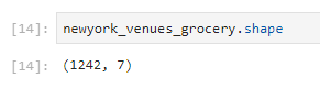
So, there are 40 neighborhoods that we have to choose from that are part of greater Manhattan, so now we linked the neighborhood data to the Foursquare data in order to see how many competitors there are and where the food venders in the city cluster. We quickly discovered that there are 1242 grocery stores in Manhattan, at least as Foursquare define them.
So, where are they? 1242 data points on the map looks like this:
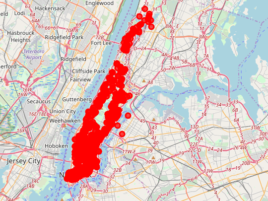
But when you zoom in, you can get to individual locations as such:

One can observe that density varies greatly. Much variation is surely due to the availability of appropriate buildings given the way the market currently operates.
Exploratory Analysis Part 3
When we begin to look in to the grocery data, we can see certain patterns. For example, if we simply count the number of instances of a grocery vender in a neighborhood (bearing in mind, neighborhood itself is a function of the city data which is based on population) we can see which neighborhoods have the most grocery stores in terms of raw numbers.
In the ensuing list, we can see that the lowest is 13 in Marble Hill, and the highest is 50 around the Civic Center and the East Village.
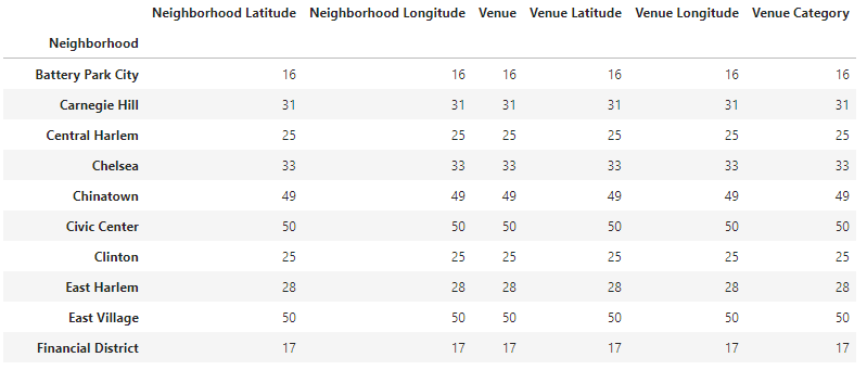
It is important to bear in mind the original data set that came from the city. What constitutes a neighborhood is the population density. So, Marble Hill has 13 sellers and the East Village has 50, but the relationship between the neighborhoods is defined by the original set based on population density. The population centriod shows us where the center of gravity is for that neighborhood, and how we’re counting the food venders within those population centers. This data, all by itself, is very valuable.
So, a place having 50 sellers v a place with 13 sellers is significant. Both have a lot of people in proximity. We could stop our analysis right here and have a meaningful amount of data to investigate.
But, there is a problem and it has to do with the Foursquare data. Foursquare reports grocery sellers across a wide range; from supermarket to bodega to deli to butcher ship and it appears there might even be some mistakes in that there are restaurants in the data set as well. So, to go deeper in to our analysis, we will look at what kind of grocery store is most common in the neighborhoods.
Exploratory Analysis Part 5
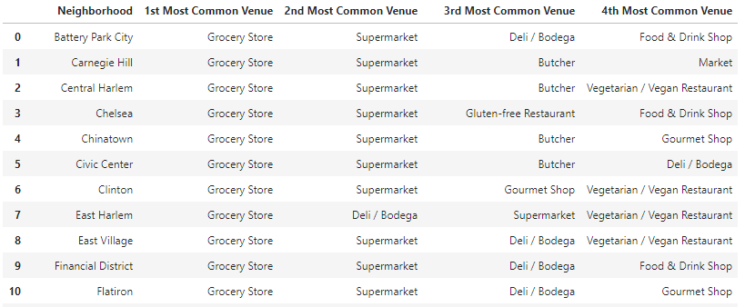
To start, we’re going to limit the type of venue to the most common top four. Way down on the list is the type of grocery store that is exactly the kind the HEB can eliminate by offering a wider variety of choices and one stop shopping. This includes specialty sellers like bakeries and butcher shops and such. By cutting these out of the analysis, we can see how the competition shapes up around the real threats which are the ones classified as supermarkets and grocery stores.
We begin by using one-hot encoding to turn each of the various venue categories in to a number and then we assign a mean value to each of these venues. We can see what percentage each of these venues represents to the whole, though that is not tremendously valuable.
But once the venues are reduced to numerical values and those values assigned a mean, we can now start to look at the most common venues, which is far more valuable. For example, by scanning this list, we can see that while every neighborhood, all 40 of them, have a grocery store listed as its most common venue type, some neighborhoods, like Sutton Place, have no supermarkets.
Exploratory Analysis Part 6
Finally, now that we know so much more about each neighborhood and what is in them, we can use k-means clustering to put each cluster on a map and see where its centroid actually is. And from there, the hard work begins at looking at individual neighborhoods to decide where to put the location. That kind of work can’t be captured in this data set, but this data analysis can direct those efforts.
The k-means clustering shows the following:

Clearly, one kind of clustering is dominate, as denoted by the number of red labels. This is cluster 0, it represents 26 of the 40 neighborhoods, and is defined as such:
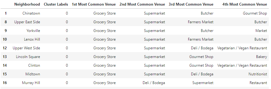
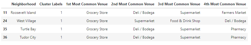
Cluster 1 is the purple cluster and it only has 4 members:
Cluster 2 is the turquoise label and it has 7 members:

And finally, cluster 3 is an odd green color that is hard to find and has 3 members:

We can zoom in on the maps and get a better look at where everything is located as follows:

By clicking on the cluster, we can see which neighborhood and grocery group it belongs to:

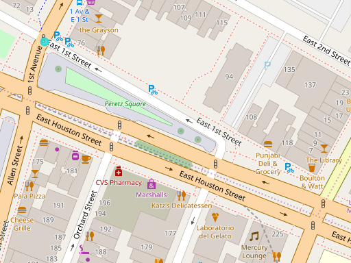
Finally, we can zoom in on the individual streets and see where the actual grocery competitors are.
Conclusions
As noted, this data set is by necessity incomplete because it can’t take into account factors like building availability, local ordinances, neighborhood character, relative crime data and such. But, what it does capture is two very crucial factors, one might say the two most critical factors, which are neighborhood centers (which addresses population) and relative level of competition.
So, given those constraints, here are a few conclusions:
- In most of the neighborhoods of Manhattan, there is a dominate pattern of competition as defined by the red dots on the map. These are 26 of 40 clusters and so it is the default competitive arrangement. To the degree that Manhattan has evened out to a general level of competition, this cluster set represents it. One could do another analysis on just the red dots and see if any of them had specific weaknesses or availabilities, but the easy conclusion is that the red zones are the default.
- One can see that there must be other factors not captured in the data set for cluster 2, the turquoise set, since all but one is in the same geographic part of the map, mainly in the Washington Heights/Harlem area. However, there is an interesting outliner in this cluster in Noho.
- Cluster 1, the purple ones, are very interesting because none have Supermarket as the second most common venue.
- Cluster 3 only has 3 members including Hudson Yards, which if one looks on the map is very centrally located in Manhattan and just across the Lincoln Tunnel from New Jersey.
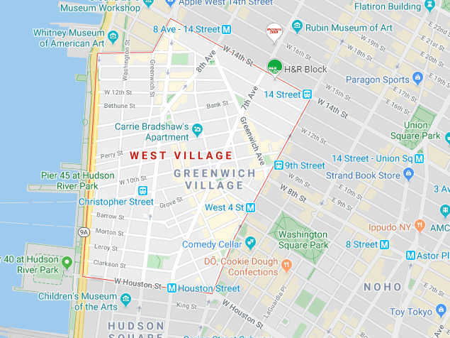
So, based on this analysis, I would look closely at three neighborhoods for a new HEB location: Noho, The West Village, and Hudson Yards. These areas have great population density and are outside of the default standard of competition.
The Winners:
Hudson Yards

Noho:

The West Village
Further analysis would be required to refine these choices and look at real estate available. But this study brings the consideration set down substantially and moves the process far forward.
